

Every few days someone on a design or dev team asks some version of the same question: what size is a phone screen, actually? The confusion is legitimate: a phone box says "1080 × 2400", the CSS says width: 390px, and the analytics say something else again. All three are correct. This guide answers the questions in the order people actually ask them, from the number you need today to the mechanics underneath it.
For the raw data — every current iPhone, Galaxy, and Pixel with physical and logical sizes side by side — keep our mobile screen sizes reference open in the next tab.
What is the standard mobile screen size in pixels?
There isn't a single standard, but there is a tight cluster. In CSS (logical) pixels — the units your layouts actually use — nearly every current phone renders between 360 and 430 pixels wide. The two most representative sizes in 2026 are 390 × 844 (mainstream iPhones) and 412 × 915 (mainstream Androids). Older but still-common devices like the iPhone SE render at 375 px wide, which remains the sensible minimum width to test.
Physical resolutions are far higher — roughly 1080 × 2400 for typical Android flagships and 1170–1320 px wide for current iPhones. But the browser scales those down by the device pixel ratio (more on that below). If you design against 390 and 412, test at 375, and keep layouts fluid between 360 and 430, you cover the overwhelming majority of real phones.
Why does my phone say 1080p but the browser says 412px?
Because there are two kinds of pixels. Physical pixels are the hardware dots in the panel. CSS pixels are the logical units the browser lays out in — deliberately abstracted so that "16px text" is readable on every screen regardless of how dense the panel is.
The bridge between them is the device pixel ratio (DPR): physical ÷ logical. A phone with a 1080-px-wide panel and a DPR of 2.625 reports a 412 px viewport (1080 ÷ 2.625). Current iPhones use a DPR of 3, so a 1170-px panel renders a 390 px layout. This is also why exported images should be 2–3× their display size. A 390-px-wide hero image looks soft on a 3× screen, where the browser has 1170 physical pixels to fill.
What is the iPhone screen width in pixels?
Both answers, since both get searched. Physically, current iPhones span roughly 1170 px wide (base models) to 1320 px (Pro Max). Logically, they render layouts at 390–440 CSS px, with the iPhone SE at 375. In practice the logical number is the one that affects your CSS, your media queries, and your breakpoints. The physical number matters when you're exporting images or screenshots — an App Store screenshot, for instance, is judged at full physical resolution. The per-model table on our reference page lists both numbers for every current device.
What is the max mobile width I should use in CSS?
480 px is the practical ceiling for "this is a phone." The largest current handsets — Pro Max and Ultra models — report logical widths of 430–440 px, so a @media (max-width: 480px) query catches every phone without accidentally swallowing small tablets. The conventional next boundary is 768 px for tablets (the iPad's classic portrait width), and everything above that is laptop/desktop territory.
That said, the modern best practice is to need fewer breakpoints, not more: build fluid layouts with minmax(), clamp(), and percentage widths, then add breakpoints only where the design genuinely breaks. Content-driven breakpoints outlast any device list — including ours.
Do foldables and tablets change the math?
Foldables add one honest wrinkle: the same device reports two different viewports — roughly phone-width folded and small-tablet-width unfolded (Galaxy Fold-class devices land near 344 px folded and 673 px open, though models vary). If your 360–480–768 boundaries are fluid rather than hard-coded to devices, foldables just work.
Tablets render at 744 px (iPad mini) through 820 px (iPad Air) up to about 1024–1032 px (large iPad Pro) in portrait, at a DPR of 2. The trap to avoid: an iPad Pro in landscape reports widths that overlap small laptops, so never assume "tablet" means "touch" from width alone.
Which screen sizes should I actually test?
A pragmatic 2026 test matrix is five viewports: 360 × 800 (compact Android), 375 × 667 (iPhone SE — the smallest mainstream survivor), 390 × 844 (mainstream iPhone), 412 × 915 (mainstream Android), and 768 × 1024 (tablet portrait). Cover those five and genuine layout bugs on other devices become rare.
Where to get real usage numbers for your audience rather than global averages: your own analytics first, and StatCounter's screen resolution stats for market-level context — globally, 360 × 800 has hovered among the most common mobile viewports for years, a useful reminder that the world's median phone is smaller than the one in your pocket.
What about notches, punch-holes, and safe areas?
Logical width tells you how wide the viewport is, not how much of it is safely usable. Modern phones reserve slivers of the screen for cameras, status bars, and gesture areas — the iPhone's Dynamic Island being the most famous — and content positioned at the very edges can be clipped or overlapped.
The web platform's answer is safe-area insets: declare viewport-fit=cover in the viewport meta tag and pad fixed elements with env(safe-area-inset-top) and friends, so headers and bottom bars step around the hardware automatically. The practical rules of thumb: keep interactive elements out of the outermost ~20 px on notched devices, remember that landscape rotates the notch into a horizontal inset, and test any fixed-position footer on a real gesture-navigation phone. The home-indicator area swallows buttons that sit flush to the bottom edge.
What image sizes do these screens need?
Screen math flows straight into asset math. A full-width hero on a 390-px layout needs roughly 1170 physical pixels (3× DPR) to look crisp — which is why responsive images with srcset exist: serve ~800 px to compact Androids at 2×, ~1200 px to iPhones at 3×, and let the browser pick. Exporting one 3000-px image for everything works visually but wastes megabytes on every mobile visitor; exporting at display size looks soft on every flagship.
Two shortcuts for the common cases: our image resizer produces exact-pixel variants for srcset sets in the browser, and the social media image resizer handles the platform-specific canvas sizes (which are their own standard, unrelated to device viewports — an Instagram post is 1080 × 1350 regardless of what phone views it). When you're deriving a size from an aspect ratio — "what's 16:9 at 412 wide?" — the aspect ratio calculator does the arithmetic without the off-by-one rounding errors that creep in at 3 a.m.
Common mistakes with mobile screen sizes
Designing at physical resolution. A 1080-px-wide mockup viewed as a 412-px layout renders everything ~2.6× too small. Design tools should be set to logical sizes (390 or 412), with assets exported at 2–3×.
Hard-coding device breakpoints. A breakpoint at exactly 393 px because some phone reports it will be wrong within a hardware cycle. Break where the content breaks.
Forgetting the viewport meta tag. Without <meta name="viewport" content="width=device-width, initial-scale=1">, mobile browsers render pages at a legacy 980 px and zoom out — the number-one cause of "my site looks tiny on phones."
Testing only on your own flagship. Your Pro Max is in the 95th percentile of phone sizes. The 360-px compact Android is where layouts actually crack.
Sources & methodology
- StatCounter screen resolution statistics — market-share context for common viewports; figures shift monthly, treat specific percentages as indicative.
- MDN: viewport concepts — the physical vs CSS pixel and DPR model summarized above.
- Device figures (iPhone 1170–1320 px physical / 390–440 logical at 3× DPR; Android ~1080 × 2400 at ~2.6× DPR; iPad 744–1032 logical at 2×) reflect current-generation hardware as of September 2026 and are maintained per-model on our mobile screen sizes reference.
Harshil writes about privacy-first tools, developer productivity, and the trade-offs between browser-based and uploaded utilities.
TL;DR: Design at 390 × 844 and 412 × 915 logical pixels, test down to 375 and 360, cap "phone" at 480 px and "tablet" at 768 px, export images at 2–3× for high-DPR screens — and keep layouts fluid so the next foldable doesn't break anything.

Harshil
Developer & Founder, stax.tools
Harshil is the developer behind stax.tools, building privacy-first tools that run entirely in your browser.
More by Harshil →Tools mentioned in this article
- Mobile Screen Sizes Reference
Complete 2025–2026 reference for iPhone 17, Galaxy S25, Pixel 9a, and iPad screen sizes, resolutions, PPI, and device pixel ratios. Toggle CSS vs physical pixels.
- Aspect Ratio Calculator
Calculate, simplify, and scale aspect ratios for video, photo, and design.
- Image Resizer
Resize images by exact pixels, percentage, or longest side. JPEG, PNG, and WebP output with quality control. 100% client-side.
- Social Media Image Resizer
Resize images to correct dimensions for Instagram, Facebook, Twitter/X, LinkedIn, YouTube, and WhatsApp. Cover, contain, or fill fit modes.
Related reading
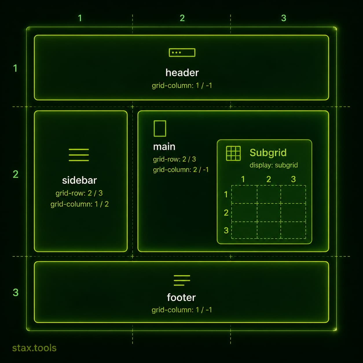 CSS Grid in 2026: Subgrid Is Everywhere — Here's How to Actually Use ItCSS Subgrid reached full cross-browser support in 2023 and is changing how developers build complex layouts. This guide covers the Grid fundamentals you need, how Subgrid solves the alignment problem, and when Grid beats Flexbox.5 min read
 How to minify CSS and JavaScript without a build toolYou don't need Webpack, Vite, or a Node.js pipeline to minify CSS and JavaScript. Here's how to shrink your assets in the browser, on the command line, or inside your editor.7 min read
 How to Compress a Video Without Uploading It Anywhere (2026 Guide)Shrink a video by 50–80% for WhatsApp, email, or the web — entirely in your browser, with nothing uploaded. Step-by-step guide with presets explained.6 min read
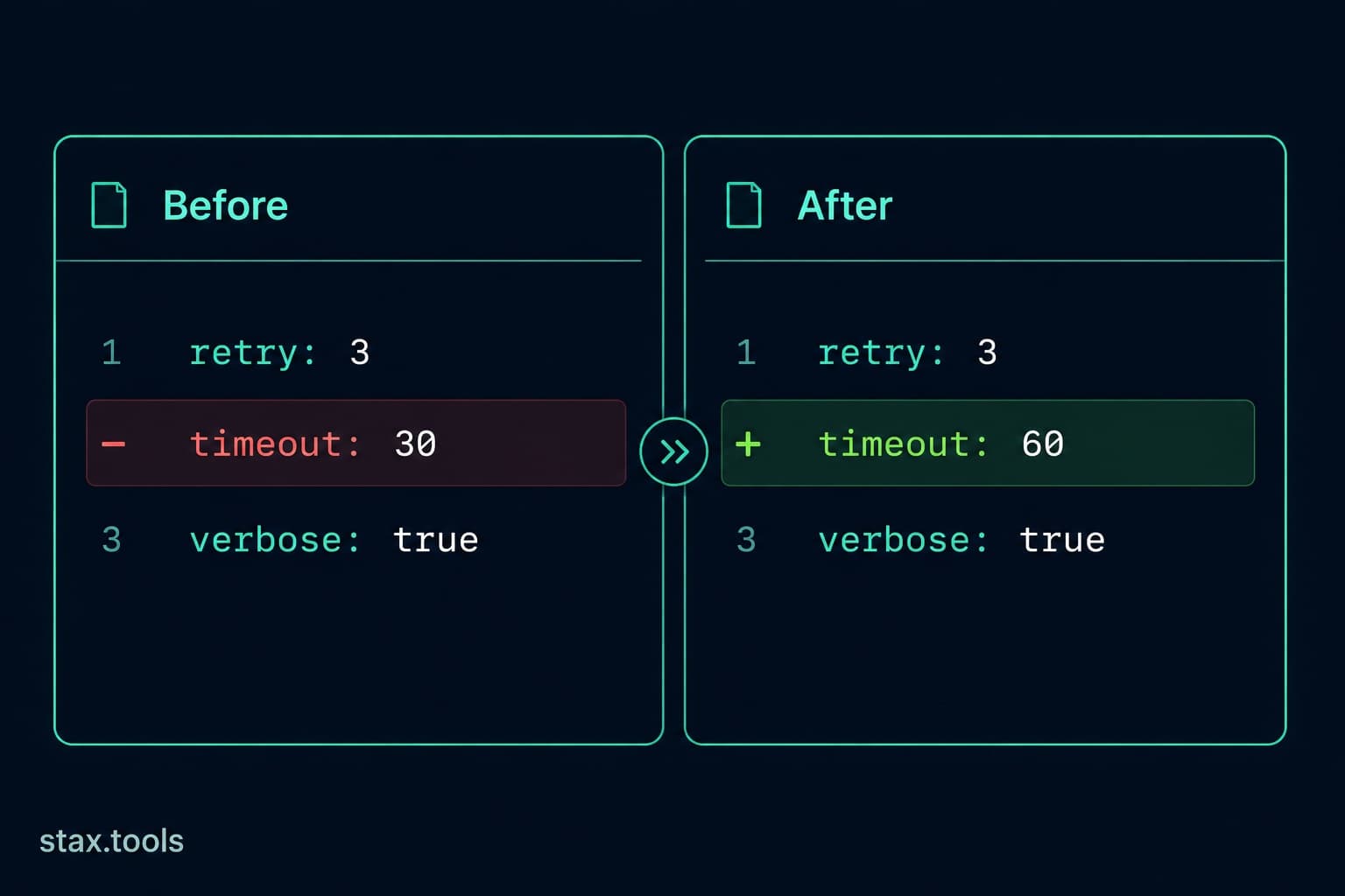 Diff Checker: What It Is, How It Works, and 6 Use Cases Beyond Code ReviewA side-by-side comparison of diff algorithms, how unified and split diff formats work, why character-level diffs matter for text editing, and practical use cases for diff checkers outside of version control.6 min read
Found this useful?
Browse 235+ free privacy-first tools — no login, no uploads, instant results.